
In a previous post we introduced our Wine Graph and discussed how it has provided a fantastic opportunity to demonstrate the value of our GraphRAG AI platform when analyzing knowledge graphs.
We explained that the origins of the graph lie in a research project by Professor Rogério Xavier de Azambuja of the Federal Institute of Education, Science and Technology, Rio Grande do Sul, Brazil. Entitled X-Wines, it is a huge dataset of more than 100,000 wines made by 30,000 producers in 60+ countries.
This post will look at the steps we took to build the Wine Graph from Professor Xavier’s dataset, before discussing how knowledge graphs – and Data Graphs in particular – offer multiple avenues for search and discovery.
Building the Wine Graph
As much as any other consumer commodity, wine lends itself to categorisation. When it comes to making a choice, wine lovers typically make decisions based on one or more classifications: price, color, grape, region, country, body, alcohol level, oaked or unoaked. Aficionados may also take an interest in the type of oak used in a wine’s ageing, the year it was made, the drinking window, food pairing, and expert reviews, to name a few.
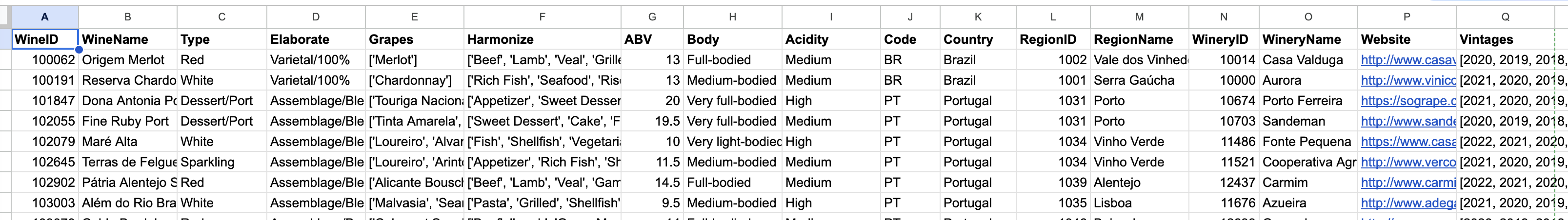
The X-Wines data came to us as a single flat CSV with each row representing a wine. Its columns represented many of these commonly-used categories:
The first step in transforming X-Wines into a knowledge graph – ideally the first step in creating any knowledge graph – was to create the domain model. This describes the types of information in the graph and the relationships between them. Not only does the domain model provide a simple reference to the structure of the data. It also provides the template for all the graph’s data and the foundation for good governance.
Domain-driven design asks us to consider how users will interact with the data we are working with. So when building a domain model we need to look at all the types of information on offer and consider what structure will best serve the users’ interests, while ensuring that we accurately represent the domain under consideration.
When it comes to the X-Wines data, this means deciding which columns and data points should represent entities or classes. And which should represent properties on those classes.
Depending on the use-case, we might make different decisions. For a graph serving as a directory of wineries, for example, we might make a Winery class the central node with the most important relationships, eg:

You can imagine that a variation on this model with a more agricultural focus might make the Vineyard its central focus.
In our case, though, we decided to keep the wines at the heart of the model. This was partly because this best reflected the weight of information in the X-Wines data. And partly because we wanted to provide users with information primarily about the wines – rather than, say, the winemakers, the regions or the foods.

(Of course it’s possible to create a graph where the Wine class is as detailed as above and the Winery as detailed as in the first example. The question would be how this served the users’ interests.)
With the model in place we created a simple dataset structure, with one dataset for each class. We then took a couple of steps to format the CSV data to be compatible with our model.
We made a new sheet for each of our relational classes – ie, every class used to describe a property on Wine. These we populated with deduplicated instance data extracted from the Wines sheet, with each item represented by a unique identifier.
As well as capturing all of the X-Wines properties, we added geo-coordinates to each winery and each region using the Google Maps API to allow geospatial queries on the data.
With this relational data in place, we injected the identifiers back into the Wine sheet and we were ready to go. We used Data Graphs’ CSV upload tool to ingest each sheet into each dataset, taking advantage of its property mapping and relationship identification features.
Discovery through exploration
With relational databases, exploration is inherently complex, requiring a specific, specialist skillset and often some engineering.
Although it might be relatively simple for someone with a basic understanding of SQL to find all the wines made with Pinot Noir, say, or all the producers in California. Making more complex inferences – eg, find all the wines with an ABV less than 14% made with the same grape variety as a given wine – involves writing convoluted queries across de-normalized tables using Joins. And as your interest becomes more specific, these typically become more and more tangled.
Not only is the complexity involved in querying your data an issue. More important, arguably, is the fact that you have to know what you are looking for in the first place. In this context it can be easy to miss data surfaced by a specific query – making it unlikely that you will stumble upon something you’re not looking for. So exploration in a real sense is hard to achieve.
There are no such problems with Data Graphs. Using the Graph Explorer, you can literally navigate through your data – in this case through a world of wine – from one piece of data to the next irrespective of how or where it is stored. Not only does its visually intuitive UI make exploration simple and accessible, it also helps uncover hidden data.
Take the following example.
After searching for rosé wines from Puglia in Italy that are good with vegetarian food, you find yourself looking at Polvanera Rosato. Opening the Graph Explorer, you notice that it is also good to drink with mature cheese. Selecting this node throws up 15 wines with that pairing.

One of these, 8th Generation, Pinot Meunier Rosé, sounds like it is made, unusually, with 100% Pinot Meunier. So you click on it to find out more and discover that it is from a region in Canada called Okanagan Valley.

So from a starting point looking at rosé wines matching vegetarian food in Italy, you have discovered in a matter of seconds that producers in a little-known region in central Canada are producing a 100% varietal wine from a grape traditionally used as part of a blend to make Champagne.
Which gets you thinking… What else goes on in Okanagan Valley? And how many other wines are made with 100% Pinot Meunier? And you set off to investigate and see where that journey will take you.
Insights from aggregation
The impressive breadth and depth of the X-Wines data offers fantastic potential for analyses from across the graph. Which South American wines are a good match for mushrooms and beef, for example? Or what are the ABVs of the wines produced by each winery in California?
Unearthing such real-world trends or insights often means writing queries that touch the extremities of a model. In such cases, where we involve entities more than one step away from each other, we cannot avoid a degree of complexity.
This is where we turn to Data Graphs’ OpenCypher query engine. This visual query builder tool allows you to create a query step by step, making a series of choices based on your model’s entities and relationships. Although it requires some understanding of data aggregation principles, you don’t need specialist knowledge of query syntax to get fantastic results.
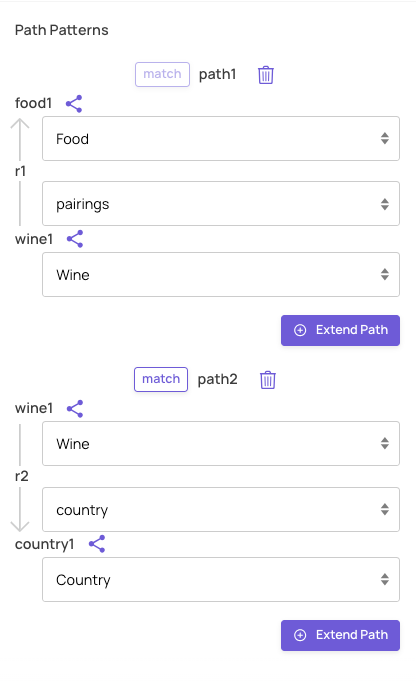
So in the example above about food pairings for South American wines, we choose two paths to match: wines and their food pairings and wines and their countries:
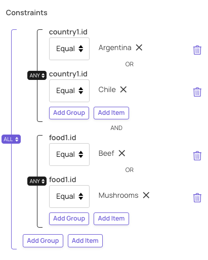
Then we add constraints to specify which countries and which foods we are interested in:
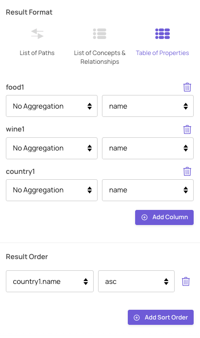
Then we choose how we want to display the results – in this case, a table showing the names of the wine, countries and foods, sorted by country:
This produces the following query and table:

Although the query looks similar to SQL, there are two significant advantages to the Data Graphs cypher query builder.
Firstly, the simplicity of the UI lowers the entry level when it comes to analyzing your data. No longer is this a specialist field. It is open to anyone who has an interest in the data and involves the minimum of instruction.
Secondly, as we reported last year, Data Graphs’ cypher query engine is extremely fast. Of course this makes the UI more responsive and the user’s experience generally more satisfying. But the real value comes when you wire up one of the cypher query engine endpoints on the Data Graphs API, allowing you to make super-efficient requests for data from a complex graph where it might ordinarily take multiple requests and aggregations.
Labor of love
Developing our Wine Graph from Professor Xavier’s dataset has been a real labor of love for those involved at Data Graphs. The world of wine is suffused with categorization so it lends itself naturally to the principles that underpin domain-driven design and knowledge graphs.
Access to the X-Wines data has provided a fantastic opportunity to try out some of Data Graphs’ unique features – to better understand how our platform performs from a user’s perspective and to explore the world of wine for hidden insights and discoveries.
References
de Azambuja, R.X.; Morais, A.J.; Filipe, V. X-Wines: "A Wine Dataset for Recommender Systems and Machine Learning." Big Data Cogn. Comput. 2023, 7, 20. https://doi.org/10.3390/bdcc7010020.